When Engagement Metrics Break the Interface: A UX Breakdown of Twitch's Watch Streaks
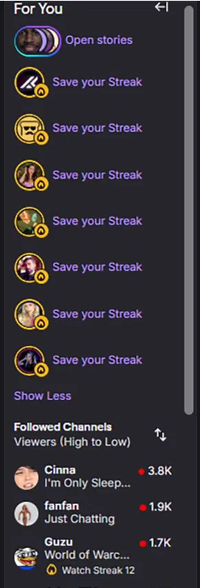
Twitch's new Watch Streaks feature converts the "For You" sidebar into a vertical stack of glowing badges, each one prompting the viewer to "Save your Streak." It is a textbook example of what happens when an interface is redesigned to serve a retention metric instead of the person reading it. Setting aside whether streaks are a good idea in principle, the implementation breaks several established usability principles at once.
Repetition destroys scannability
The clearest problem is visual repetition. The sidebar now shows a column of near-identical yellow circles, and every one carries the same label: "Save your Streak." Eight entries, one repeated message.
Interfaces are supposed to be scannable. Users do not read a sidebar top to bottom like a paragraph; they scan it for the one item they want, using differences in shape, color, and text to tell entries apart. When every row looks the same and says the same thing, that scanning process collapses. Visual hierarchy is created through variation in size, color, contrast, and placement, and this layout has none. Design guidance is explicit that size, color, and placement should create a clear path that makes it easier for users to find what they need. A wall of identical badges does the opposite: it flattens everything to the same priority, which is the same as having no priority at all.
It violates recognition over recall
Jakob Nielsen's sixth usability heuristic, recognition rather than recall, is one of the most durable principles in interface design. The rule: minimize the user's memory load by making objects, actions, and options visible, so people can recognize what they want instead of remembering it. Research consistently shows that visible, clearly labeled elements produce faster task completion and fewer errors than interfaces that force users to recall commands, locations, or previous states.
The old sidebar supported recognition well. You saw a streamer's name, avatar, the game or category, and their live viewer count. Every cue you needed to recognize "the person I want to watch" was on the surface.
The streak redesign strips those cues away. The streamer's identity shrinks to a small badge with a flame icon, the game is gone, and the name is de-emphasized in favor of the streak prompt. Instead of recognizing a channel from rich context, the viewer has to recall which anonymous badge belongs to which streamer. That is exactly the memory burden the heuristic exists to prevent, and it hits hardest for the users who can least afford it: infrequent viewers, and anyone scanning quickly.
The stakes are higher than they look
It is tempting to dismiss a cluttered sidebar as cosmetic, but the data on interface quality says otherwise. Studies have found that 94% of first impressions of a product are design-related, and that 88% of online consumers are less likely to return after a single bad experience. Bad UX is one of the leading reasons users abandon a product, and when the primary navigation surface gets harder to use, that friction compounds across every session.
There is a consistency cost too. A core principle holds that interfaces should contain only information essential to the current task; every extra element competes for attention. A sidebar whose job is helping you choose what to watch should not be dominated by eight copies of a loyalty prompt that add nothing to that task.
What the streak UI makes harder
Strip away the theory and the practical damage is straightforward. The new sidebar makes three ordinary tasks worse:
- Finding a specific streamer. With names de-emphasized and avatars shrunk into badges, locating one channel takes more effort than it should.
- Seeing who is live and what they are doing. The game, category, and viewer context that helped you decide are largely gone, replaced by a streak status.
- Catching up on what you missed. Nothing in a live-streak sidebar helps you find a past broadcast. The design assumes you are here to watch live, right now, or lose your streak.
That last point is the deepest. Streaks encode an assumption that watching means watching live. But plenty of viewing happens after the fact: catching a stream the next morning, reviewing highlights from an event you missed, or working through a backlog from ten creators you cannot watch simultaneously. An interface optimized around live-streak retention works against those perfectly normal habits.
A different design goal
VODey is built on the opposite premise: viewers should be able to find and watch VODs on their own schedule, with an interface that prioritizes clarity over pressure. You link your Twitch and YouTube accounts, sync the channels you already follow, and get their past broadcasts collected in one place across both platforms. From there you organize VODs into playlists, watch them in order with real next and previous navigation, and rely on watched-state tracking so you always know where you left off. The design surfaces the information that actually helps you decide what to watch, the streamer, the title, the platform, instead of burying it under a retention mechanic.
Watch Streaks are a useful reminder that not every new feature is designed with the viewer in mind. Some are designed to move a number, and the interface absorbs the cost. Good design is measured by whether it helps a person complete the task in front of them. By that standard, a sidebar full of identical "Save your Streak" prompts is not an improvement. It is a metric wearing the costume of a feature.